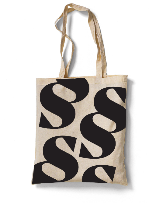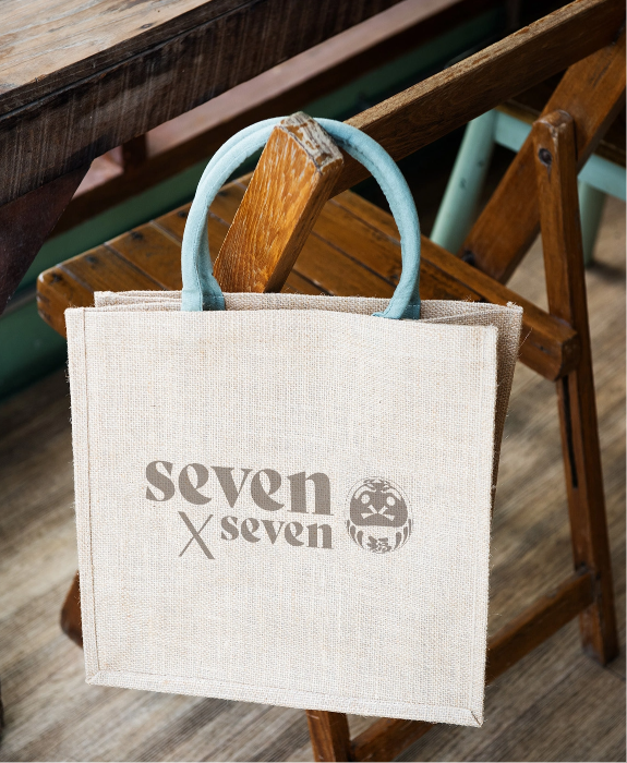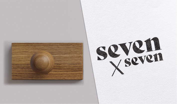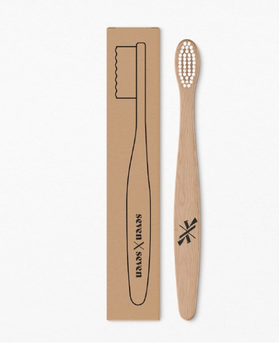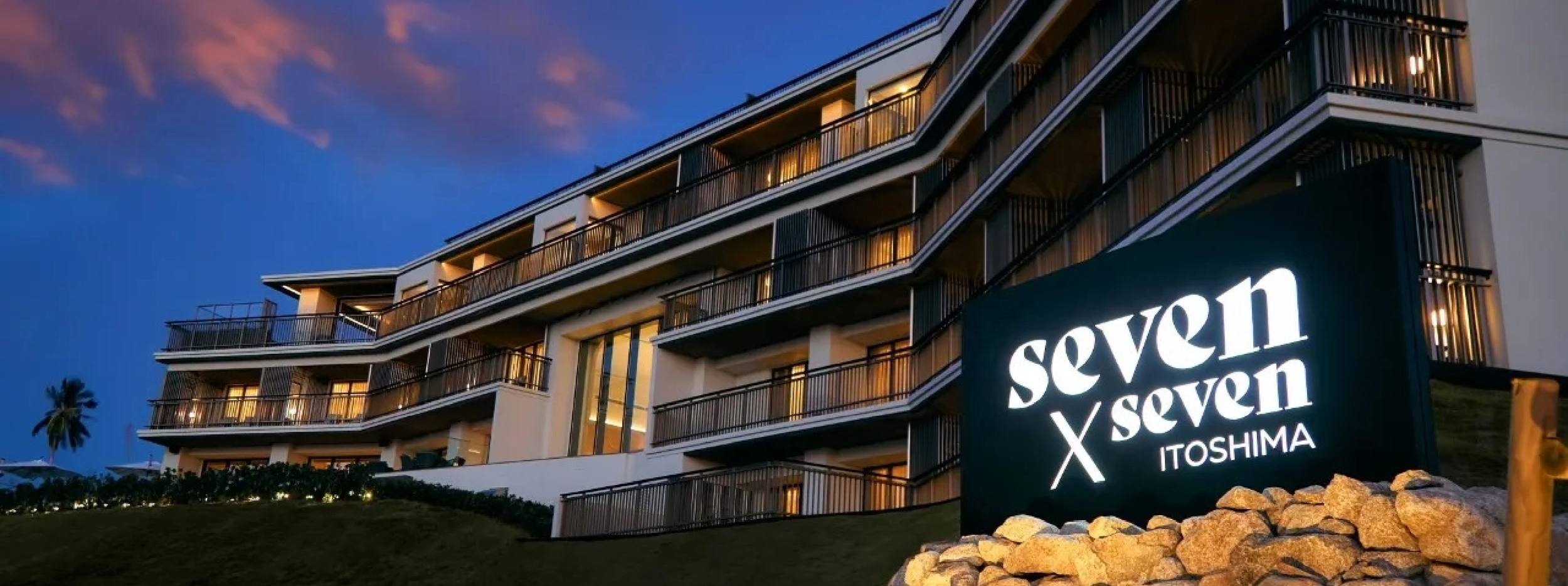
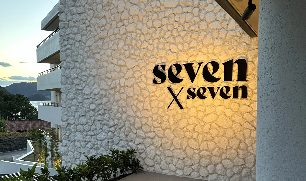
seven x seven
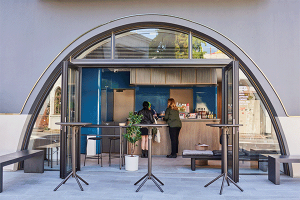
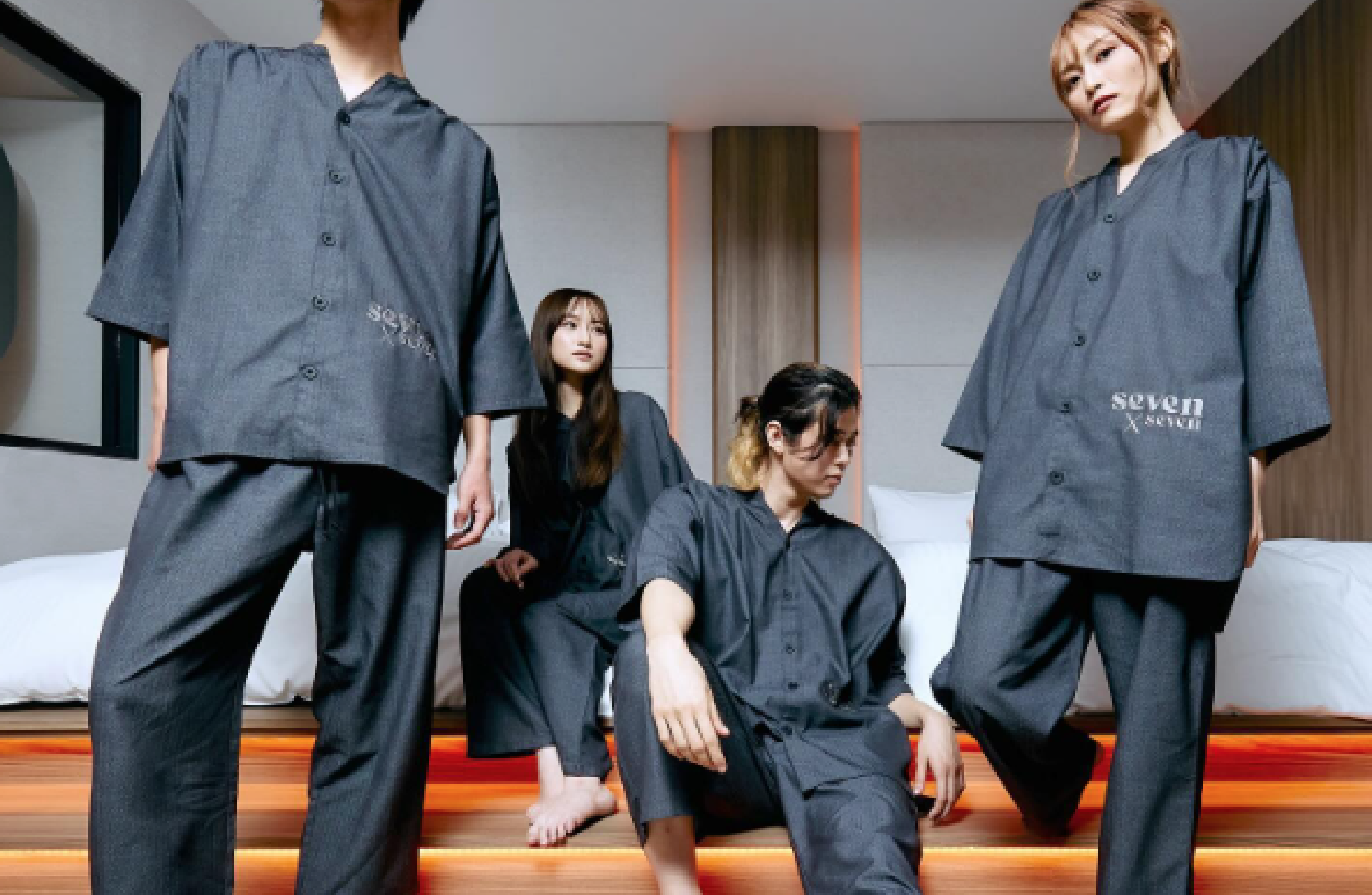
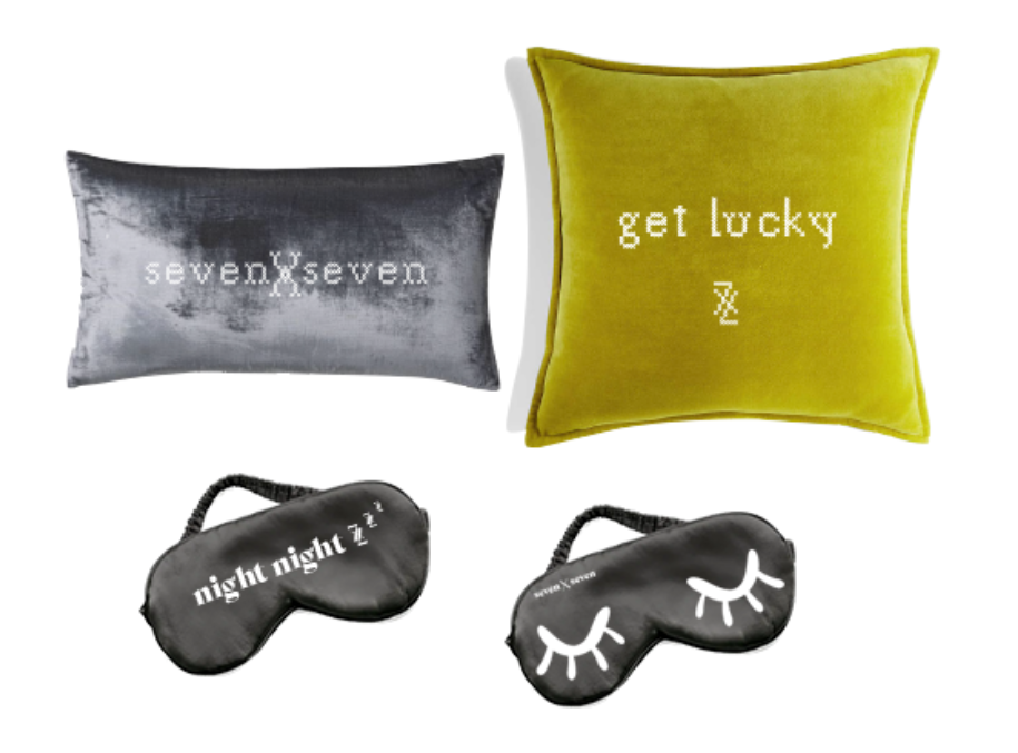
In collaborating with a Japanese luxury hotel brand to create a name, a logo, and a concept, we added to our fashion and mixed-use repertoire the wonderful world of hospitality. The logo is both classically Japanese — yet also unmistakably modern — and the design’s interplay of curves and straight lines mirrors the relationship of the hotels to their natural surroundings. All of which results in a brand that is luxurious, lively, and, just like the #7 itself,
brimming with luck.
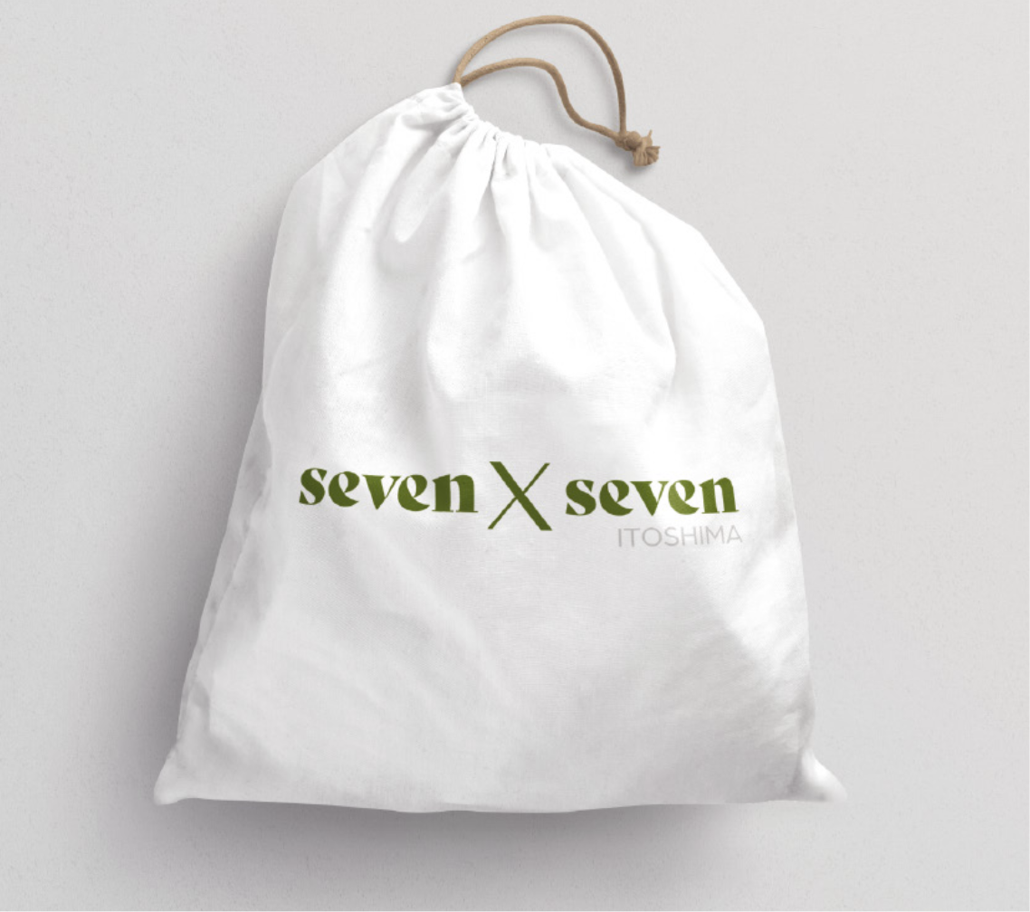
PROJECT TYPE HOTEL | LOCATION ITOSHIMA, KYUSHU + ISHIGAKI, ISHIGAKI, JAPAN
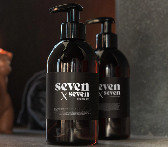
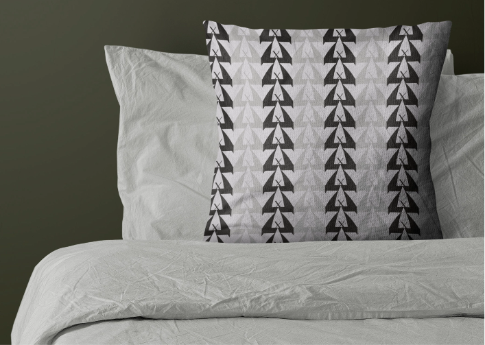
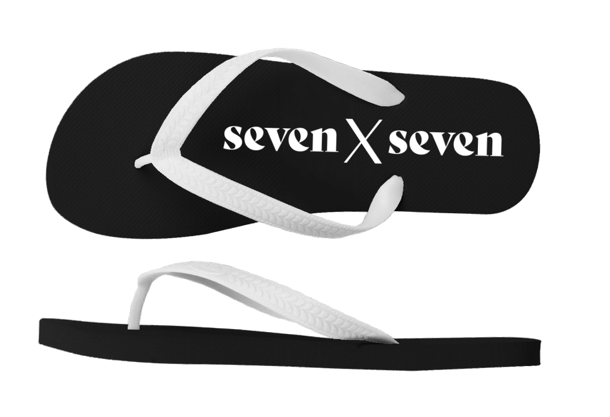
SERVICES BRANDING, NAMING + LOGO DESIGN | BRAND DISCOVERY + RESEARCH | BRAND GUIDELINES | BRAND STRATEGY | CREATIVE CAMPAIGN | EXPERIENTIAL DESIGN | MERCHANDISE DESIGN | PRINT + DIGITAL COLLATERAL
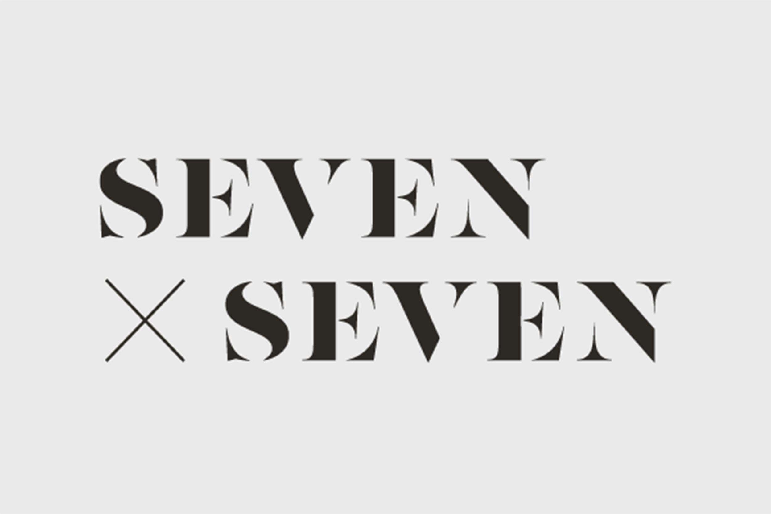
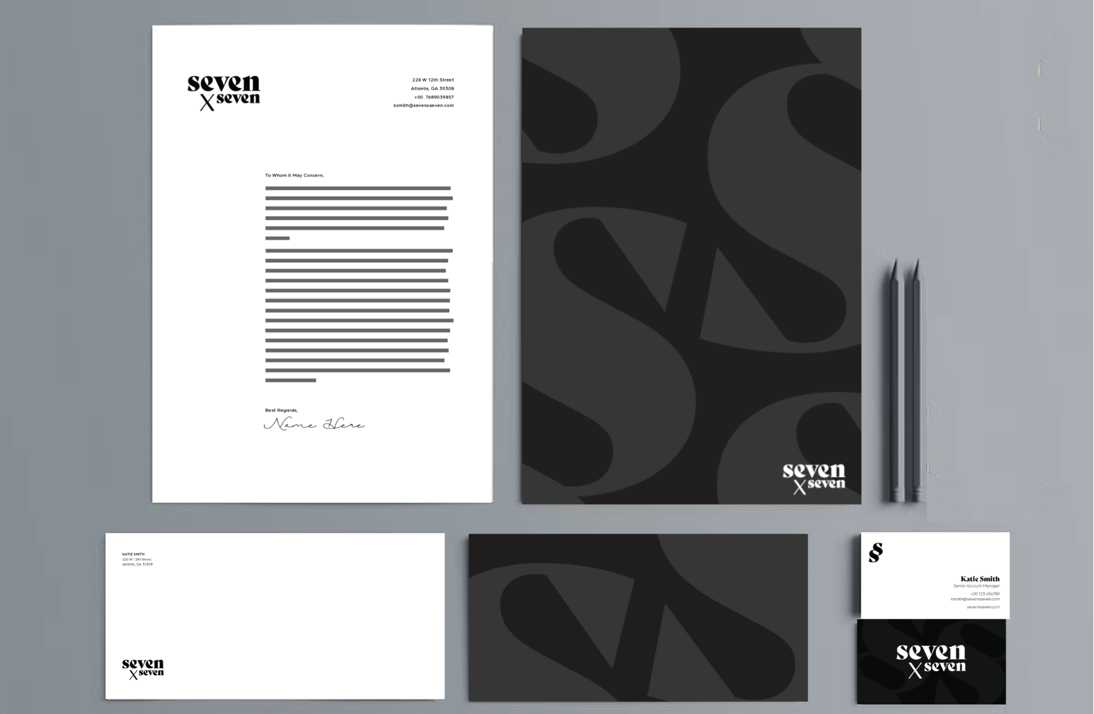
visual identity
LETTERHEAD, ENVELOPE,
BUSINESS CARDS