empire homebase
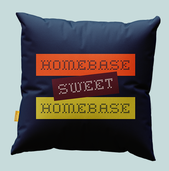
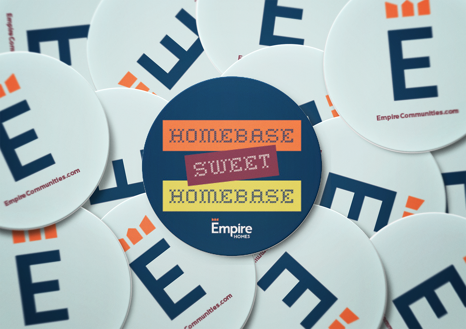
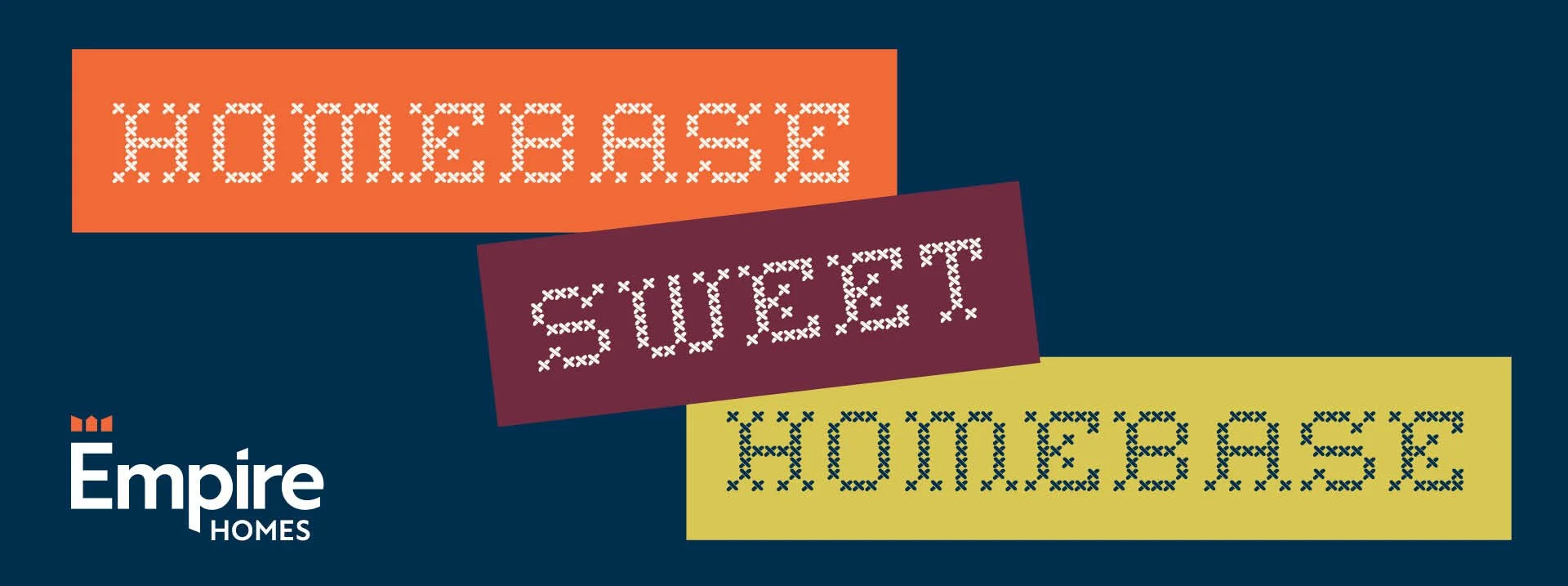
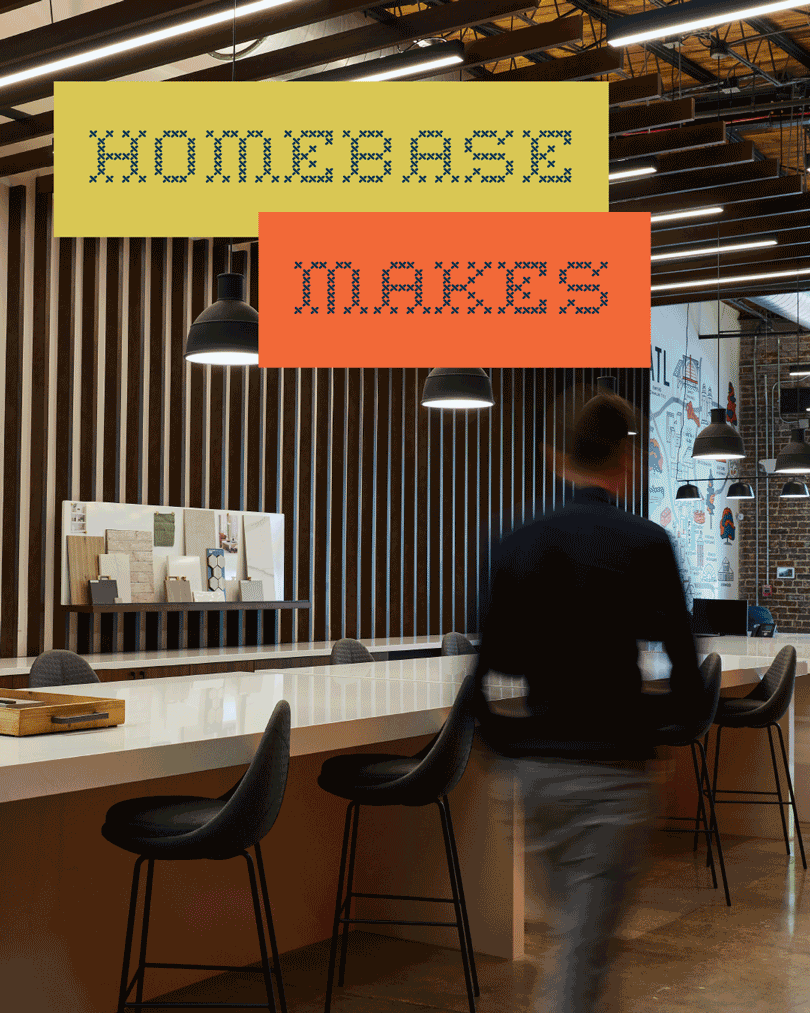
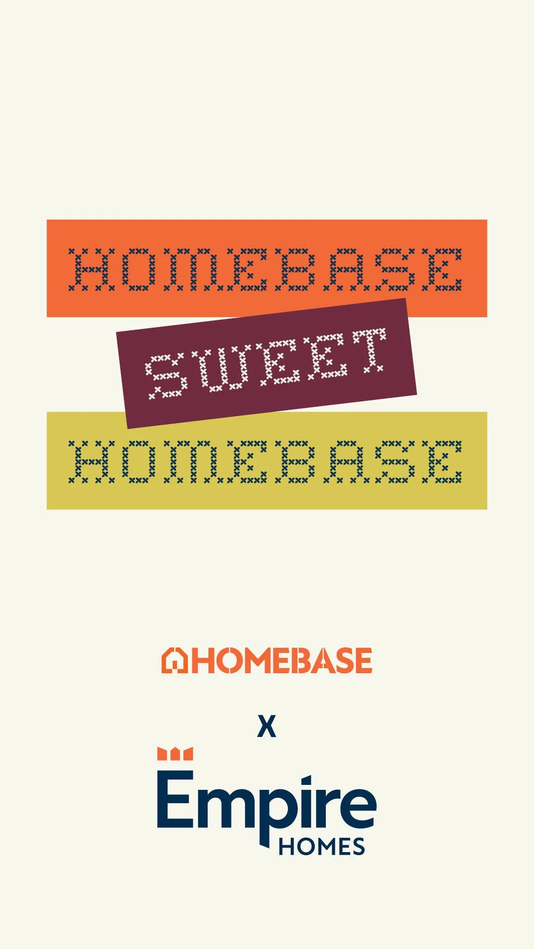
Inspired by their founding premise — "What if home-buying could actually be enjoyable?" — we created a brand that was, at the same time, fun and functional, motivating and memorable. Our concept, "Homebase, Sweet Homebase," produced art that was as varied as Empire's numerous properties, communicating both what Homebase is and how it will make potential clients feel. And with bold colors, unique typefaces, and an innovative approach, we helped communicate to Atlanta and beyond that Empire Homebase makes finding your little slice of paradise, a piece of cake.
PROJECT TYPE REAL ESTATE | LOCATION ATLANTA METRO, GEORGIA
SERVICES BRAND DISCOVERY + STRATEGY | BRAND GUIDELINES | BRAND REFRESH | CREATIVE CAMPAIGN | CUSTOM PHOTOGRAPHY | PRINT + DIGITAL COLLATERAL | SOCIAL MEDIA + CONTENT STRATEGY
ad campaign
social campaign


cross-stitch
typography
come to life