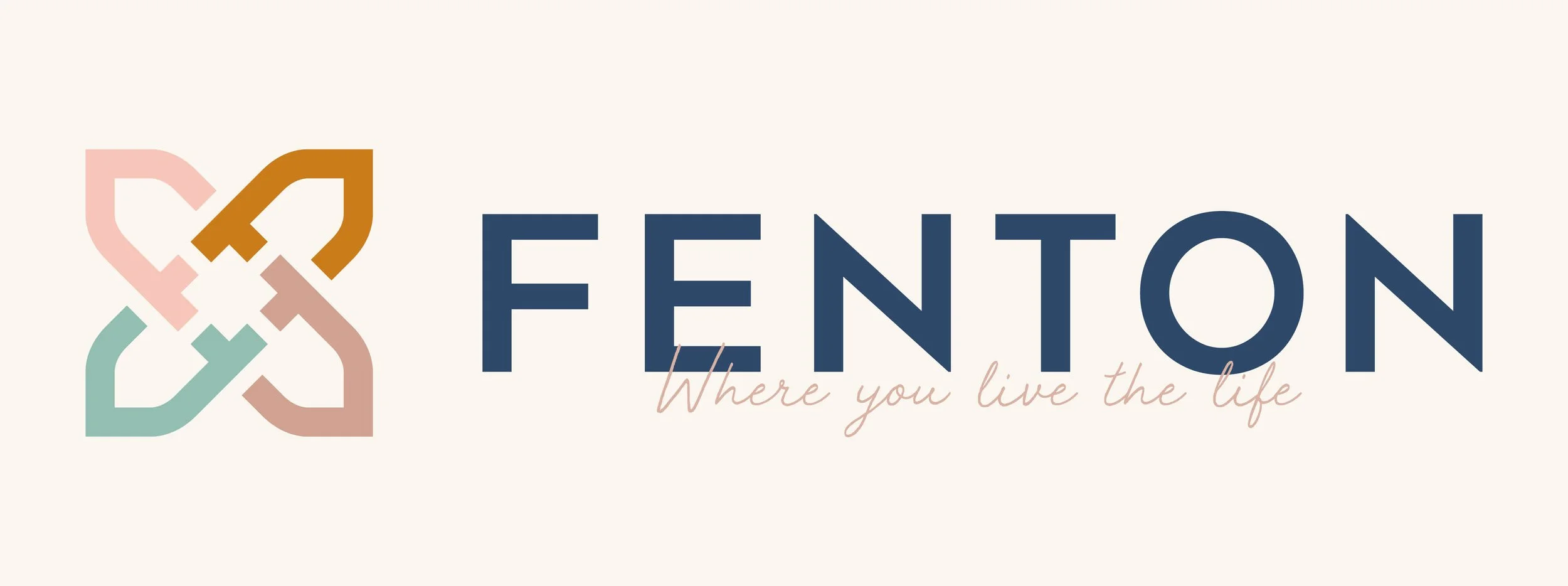
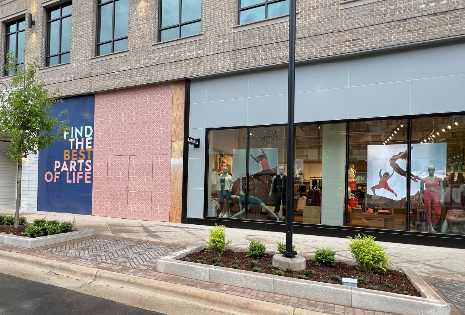
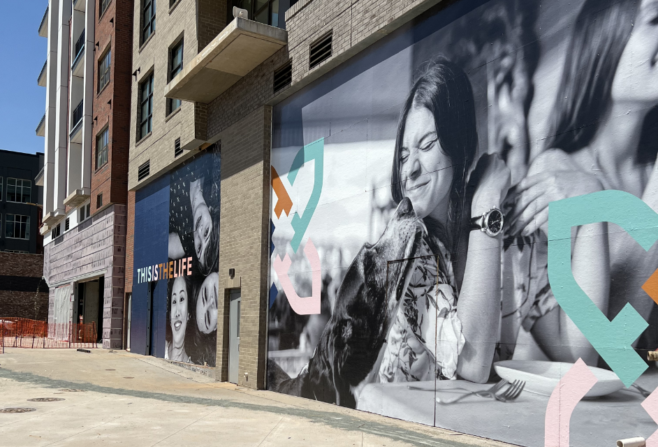
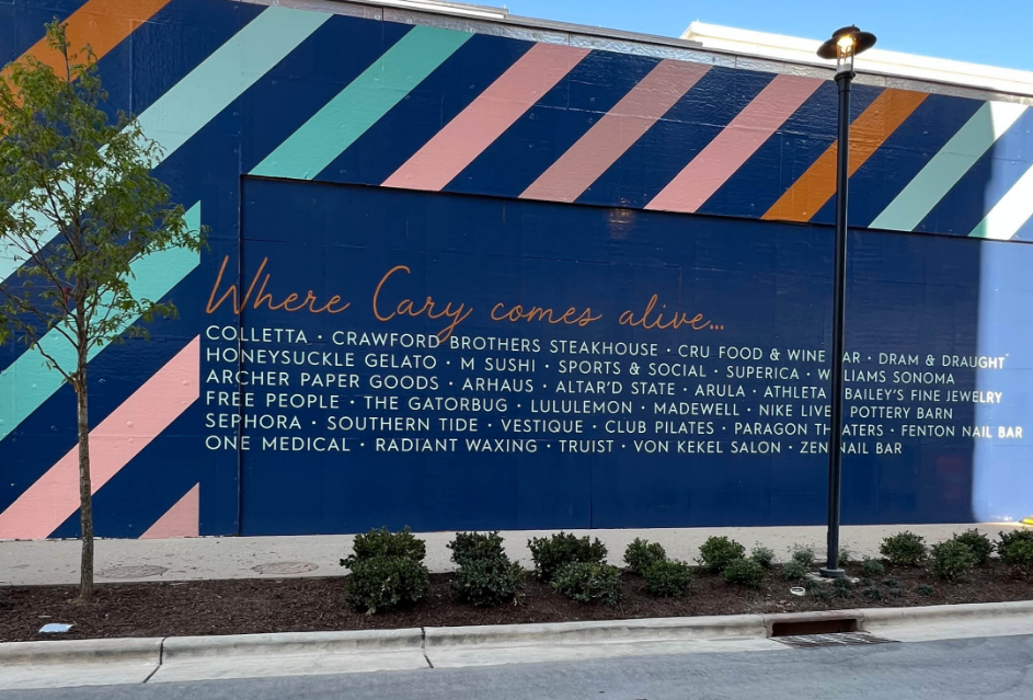
fenton
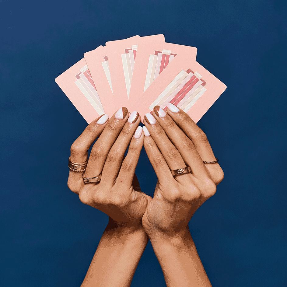
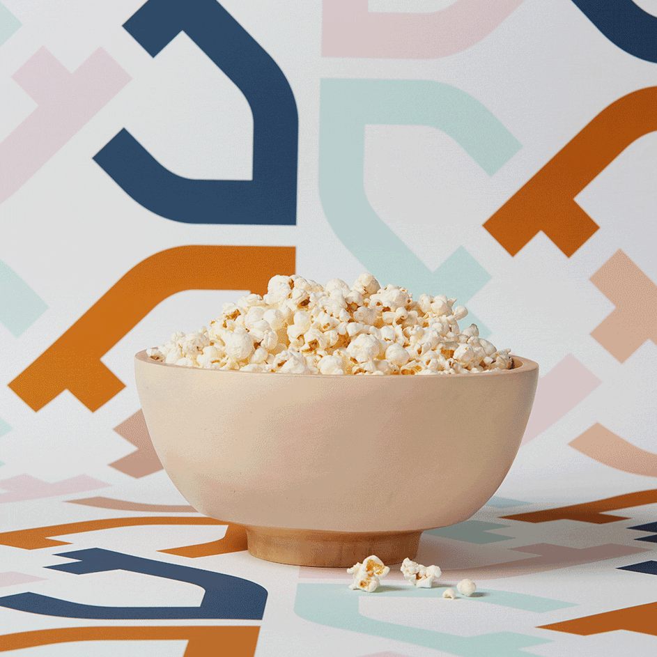
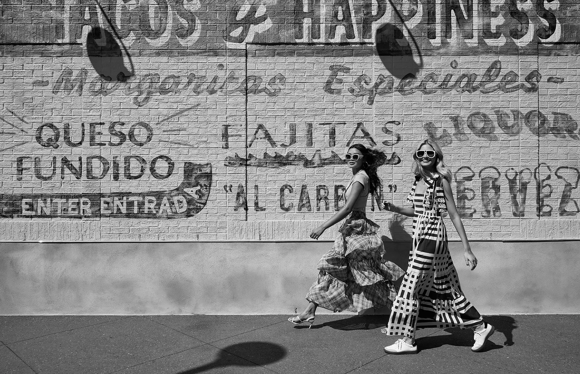
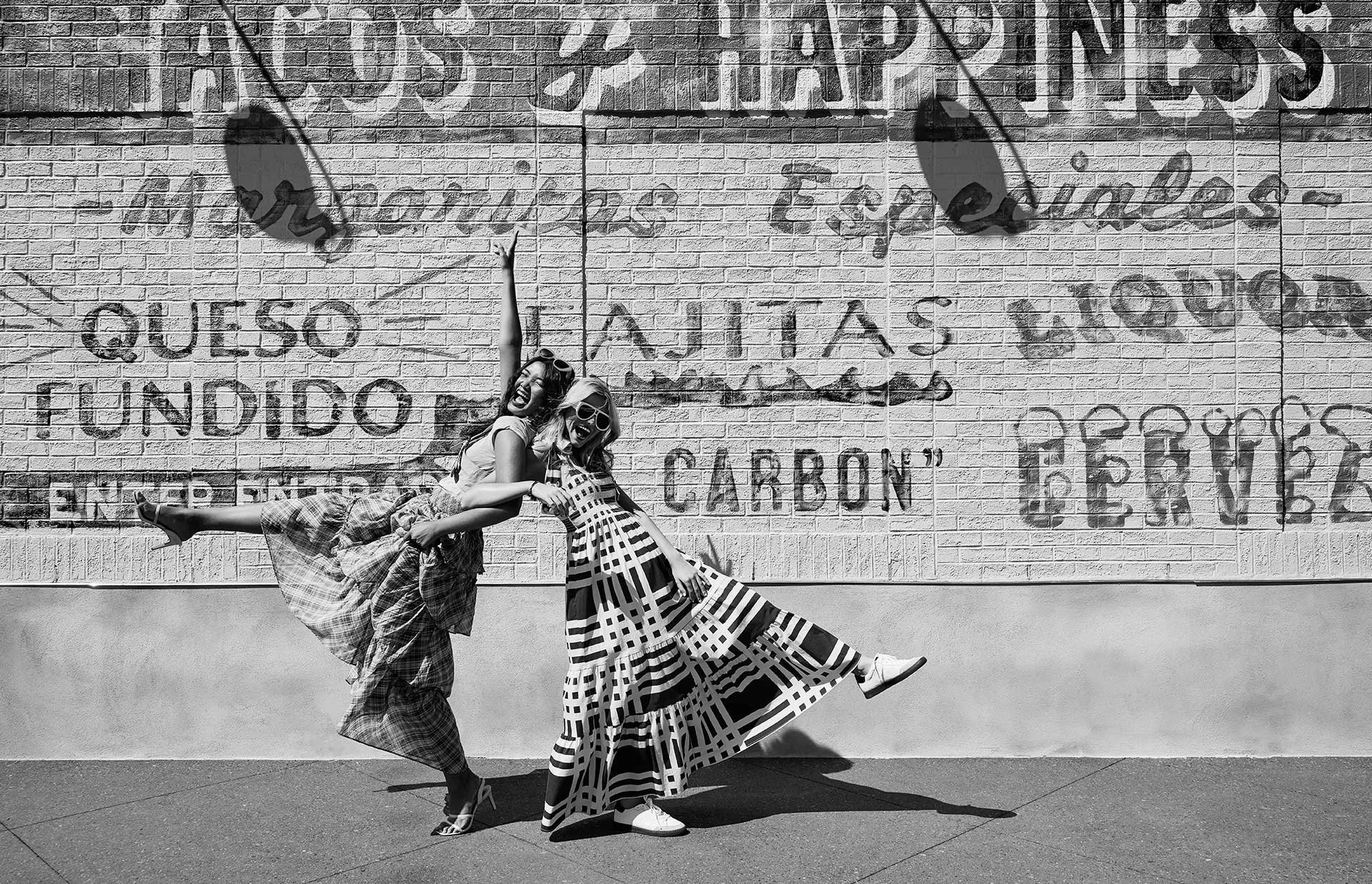
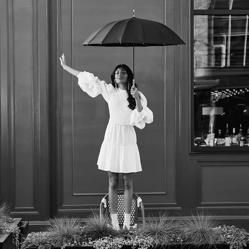
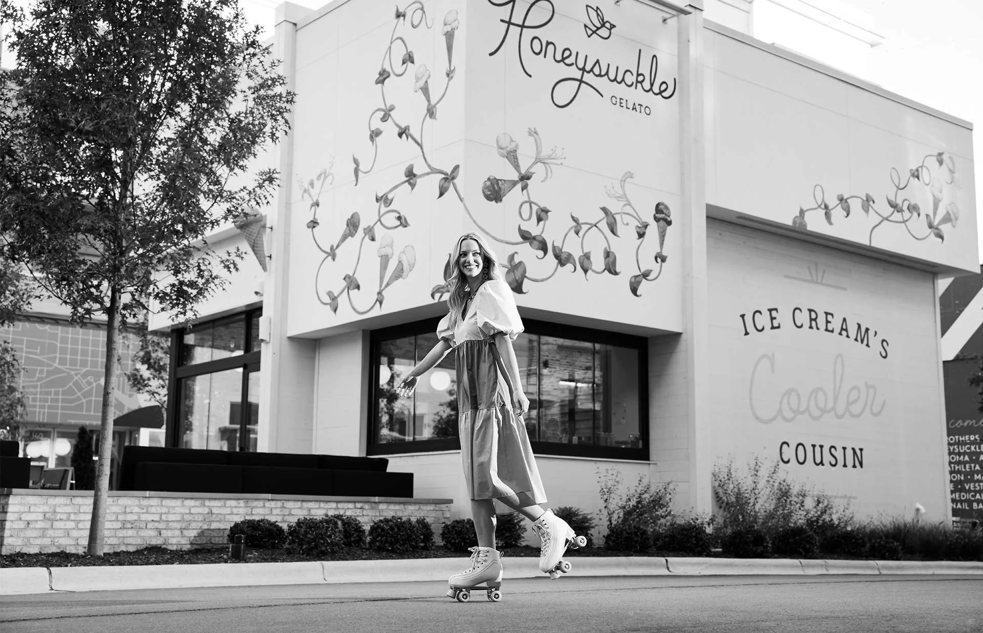
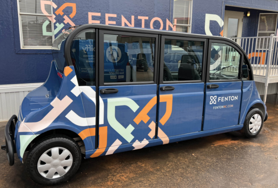
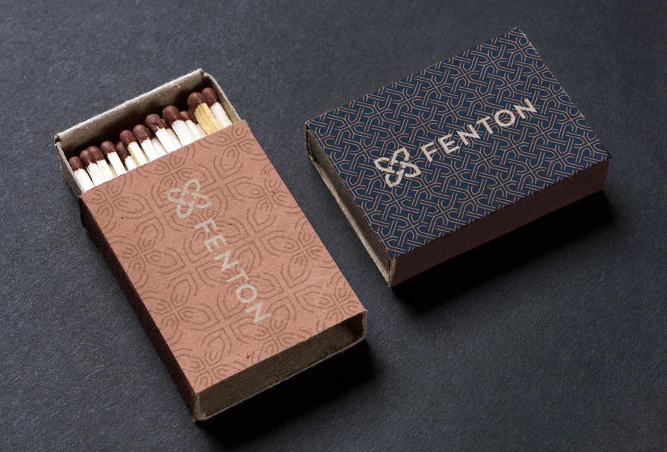
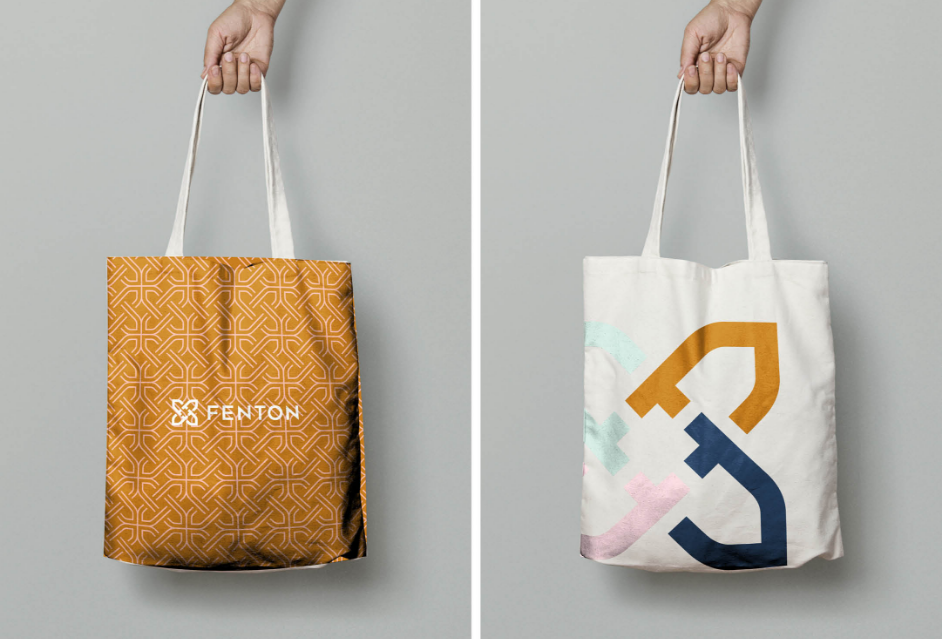
For this ground-up, mixed-use destination in rapidly growing Cary, we started with a strategy that differentiated Fenton from anything else nearby. It’s not a place to be, but the place to be. To exude this elevated, playful lifestyle, we chose for their brand colors a deep blue and a rich gold, both of which were energized by lighter pinks, blues, and greens. The messaging built anticipation, and the black-and-white photography positioned Fenton as the place — where life is fully lived, fully embraced, and fully enjoyed.
PROJECT TYPE MIXED-USE DEVELOPMENT | LOCATION CARY, NORTH CAROLINA
SERVICES BRAND DISCOVERY + RESEARCH | BRAND STRATEGY | BRANDING: COLOR PALETTE | CREATIVE CAMPAIGN | CUSTOM PHOTOGRAPHY + VIDEO | PRINT + DIGITAL COLLATERAL | SOCIAL MEDIA + CONTENT STRATEGY | WEBSITE DESIGN


brand guidelines


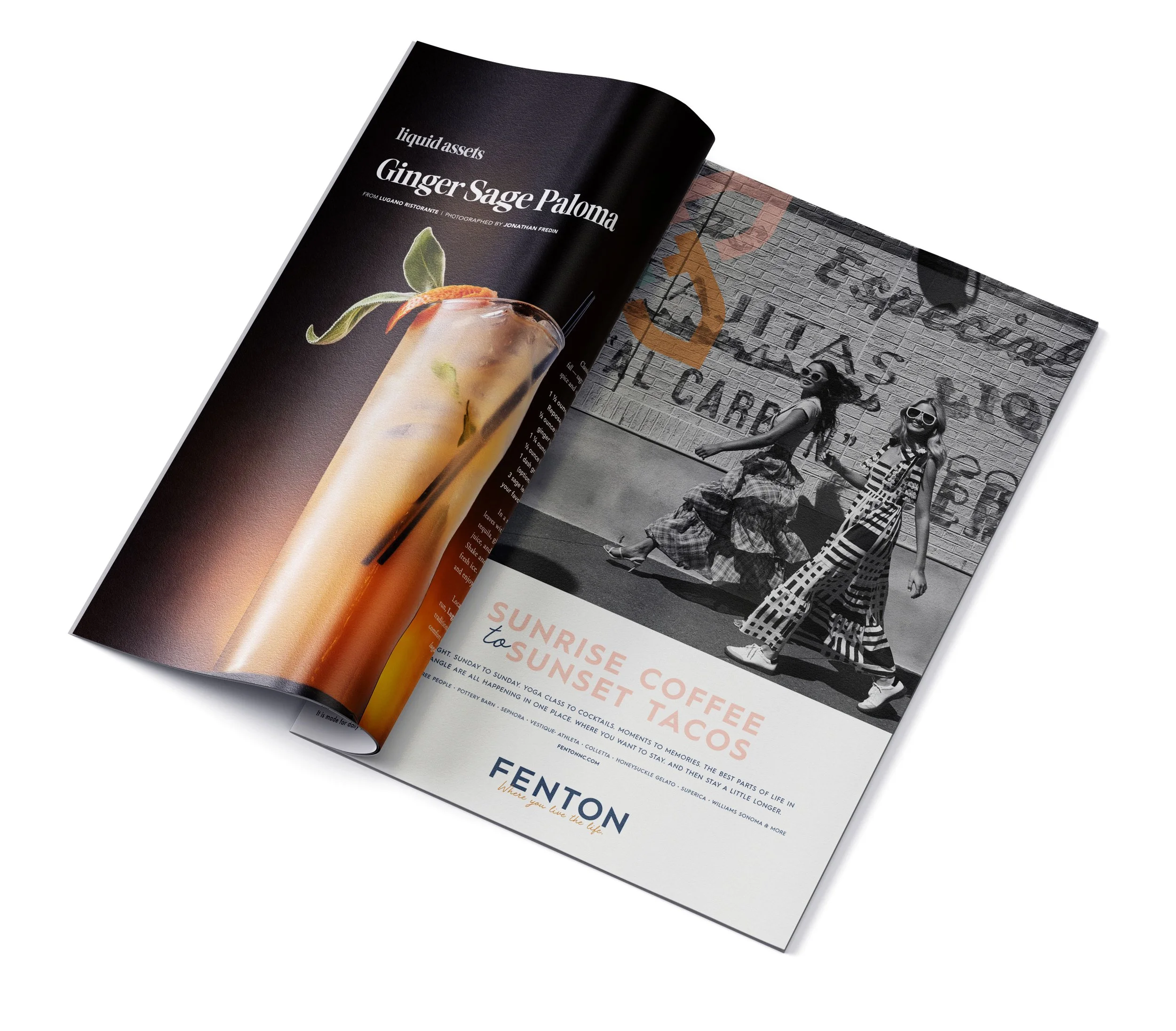
ad campaign

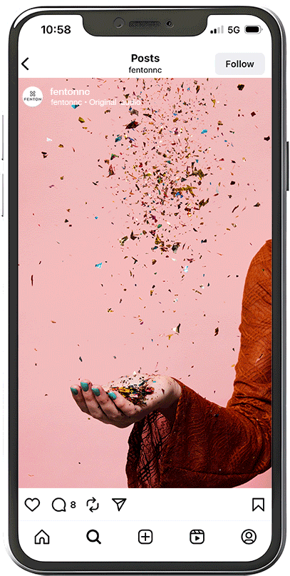
social media
CUSTOM PHOTOSHOOT
AND CREATION OF GIFS